In this article
- What an undertone is
- Why undertones show up on the wall
- How to spot an undertone
- Common undertone traps
- Matching undertones across a room
- Using undertones to your advantage
- Frequently asked questions
- What exactly is a paint undertone?
- How do I figure out a color's undertone?
- Why does my gray look blue or purple?
- Why did my greige turn pink?
- Do undertones matter for white paint?
- Should all the colors in a room share an undertone?
- Can lighting change a color's undertone?
- How is an undertone different from the main color?
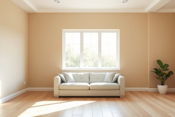
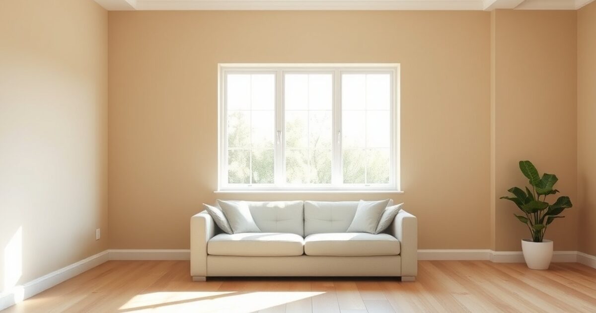
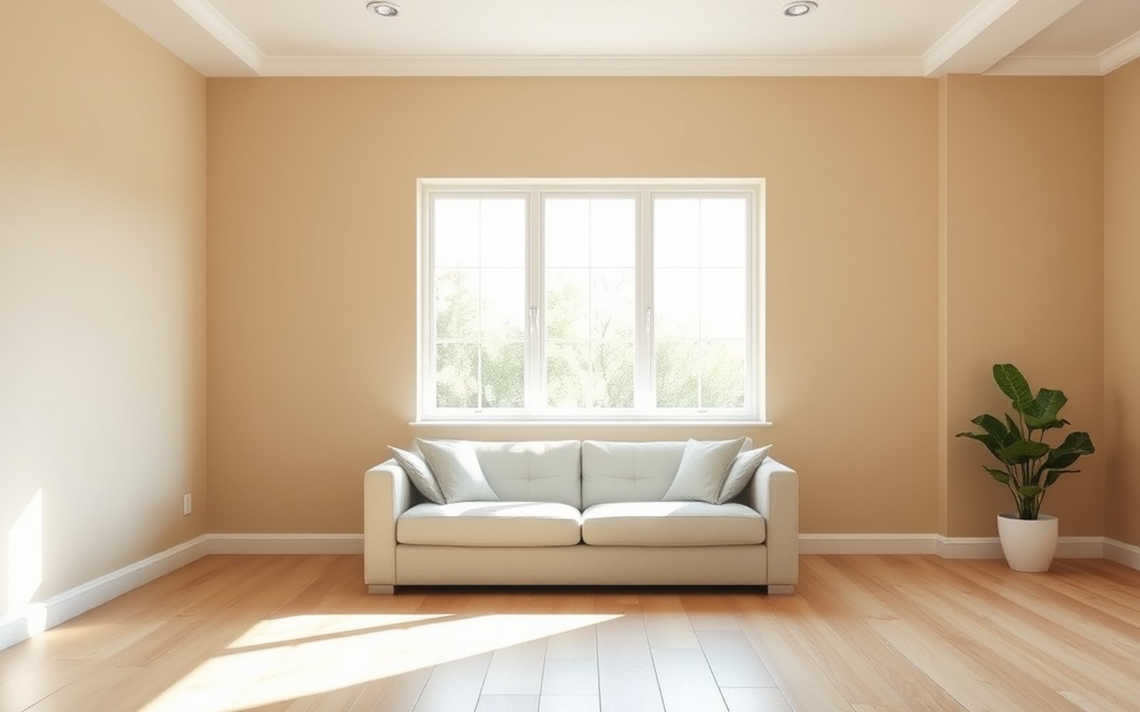
Quick answer: An undertone is the subtle secondary hue sitting underneath a color's main hue. It is why a paint that looks like a clean gray on the chip can read distinctly blue, green, or purple once it covers a wall, and why a beige can look pink and a white can look yellow. Undertones are the single biggest reason paint colors disappoint, because they are easy to miss on a small chip and impossible to ignore on a full wall. Learning to spot them before you buy is the most useful color skill there is.
Once you can read undertones, the rest of color choice gets much easier. When you are ready to price the project, check it with our paint cost calculator or grab a free painting estimate.
What an undertone is
Every paint color has two layers. There is the main hue, the obvious color you would name if someone asked, like gray or beige or white. Underneath that sits a quieter secondary hue, the undertone, which influences the overall feel without being the headline color. A gray might have a blue undertone, a green undertone, or a purple one. A white might have a yellow, pink, or blue undertone. The main hue is what you see first, but the undertone is what you live with.
Neutrals are where undertones matter most, because in a neutral the undertone is doing most of the visible work. There is not much obvious color to distract from it, so the secondary hue comes through clearly, especially over a large area. This is why two grays that look almost identical on the chip can feel completely different on the wall. One leans cool and blue, the other leans warm and slightly purple or green, and that hidden lean changes everything about how the color reads.
Why undertones show up on the wall
An undertone that you barely noticed on a chip can dominate a wall, and three forces are responsible. The first is mass. A small chip shows so little color that the undertone stays hidden, but spread that same paint across a large wall and the subtle hue accumulates and becomes obvious. More surface area means more visible undertone.
The second force is light. Natural light direction and the color temperature of your bulbs interact with the undertone and can amplify or shift it. A gray with a blue undertone can look almost neutral in warm evening light but turn noticeably cool and blue under daylight or cool bulbs. Light is why the same paint behaves differently from room to room and from morning to night.
The third force is adjacent color. Everything next to the paint influences how the undertone reads. A greige next to a cool gray floor can look warm and pink, while the same greige next to a warm wood floor can look gray. The colors around the paint, your flooring, trim, furniture, and even the next wall, pull the undertone in one direction or another. This is why a color must always be judged in place, next to the things it will actually live beside.
How to spot an undertone
The skill is comparison, because an undertone is hard to see in isolation and easy to see next to a reference. Place several swatches side by side. When you set a few grays or a few whites next to each other, the undertones reveal themselves immediately. One white suddenly looks yellow next to a cooler white, one gray clearly leans blue next to a greener one. The contrast makes the hidden hue visible.
A second trick is to look at the lightest version of the color, often the palest tint at the top of the same paint strip. The undertone is usually most exposed in the lightest tint, where there is the least main hue to hide it. If the lightest chip on the strip looks slightly green, your color has a green undertone, even if the deeper version hides it well.
The most reliable reference is a sheet of pure white. Hold your candidate against a genuinely white card or paper and the undertone jumps out, because the pure white gives the eye a true neutral to measure against. Against pure white, a warm white looks clearly creamy, a cool gray looks clearly blue, and a beige shows its pink or yellow lean. Do this for every candidate before you commit, and you will catch undertone problems while they are still cheap to fix.
Common undertone traps
A few undertone mistakes show up again and again, and knowing them in advance saves a repaint. The most notorious is greige going pink. Greige, a blend of gray and beige, is hugely popular but often hides a pink or purple undertone that only appears on the wall in certain light, leaving a room feeling unexpectedly rosy. Always check a greige against pure white and in your actual light before trusting it.
Gray going blue is the next common trap. Many grays carry a cool blue undertone that turns a space cold and clinical, especially in north light or under cool bulbs. If you want a warmer, cozier gray, look for one with a slight warm or greige lean, and confirm it does not go icy in your room. White going yellow is the third. Many whites have a warm yellow or cream undertone that can look dingy or aged next to crisp white trim or bright fixtures. If you want a clean white, check that the undertone is not pulling it toward cream in your light.
Greens and blues have their own traps too. A green can lean yellow and turn lime, or lean blue and turn teal. A blue can lean green and turn toward turquoise, or lean purple and turn cold. The lesson across all of these is the same. Never trust the name on the chip. Identify the undertone, then check it against pure white and in the room before you decide.
| Color family | Common undertones to watch | How it can surprise you |
|---|---|---|
| Gray | Blue, green, purple, greige | Reads cold and clinical, or unexpectedly purple |
| White | Yellow, pink, blue, gray | Looks creamy and dingy, or cold and stark |
| Beige and greige | Pink, purple, yellow, green | Greige going pink is the classic surprise |
| Green | Yellow, blue, gray | Turns lime when yellow, or teal when blue |
| Blue | Green, purple, gray | Drifts toward turquoise or goes cold and gray |
Matching undertones across a room
Once you can spot undertones, the goal is to make them agree across the room. A room feels harmonious when the major elements share a compatible undertone direction, and it feels subtly off when they fight. Your walls, trim, ceiling, flooring, and fixed elements all carry undertones, and the more they line up, the more the room reads as intentional.
Start from the fixed elements, since you cannot change them. Your flooring, counters, tile, and large furniture already have undertones, and the wall color should agree with them. A warm wood floor with a strong orange undertone pairs better with warm leaning neutrals than with cool blue grays that will clash. Match the wall color's undertone to the dominant fixed element and the room settles.
Trim is the other key relationship. White trim has its own undertone, and a warm cream trim against cool blue gray walls can look mismatched, while a crisp cool white pairs better with cool walls. Keep your trim white and wall undertone in the same temperature family. This whole process, working from fixed elements outward and testing in your own light, is laid out step by step in our pillar on how to choose paint colors. And remember that color and finish are separate decisions, so once the undertone is right, choose the sheen using our paint sheen guide.
The ceiling deserves a thought as well. Many ceiling whites carry a cool or warm undertone, and a ceiling that leans the opposite way from the walls can look slightly off without anyone noticing why. If your walls are warm, a warm leaning white ceiling tends to feel more cohesive than a stark cool white. Matching the temperature direction across walls, trim, and ceiling is the quiet move that makes a room feel pulled together.
Using undertones to your advantage
Undertones are not only a hazard to avoid, they are a tool once you understand them. If a room feels too cold, choosing a neutral with a warm undertone can gently warm the whole space without committing to an obviously warm color. If a room feels flat, a neutral with a subtle green or blue undertone can add quiet life. The undertone lets you steer the mood of a room while keeping the wall color looking like a simple, livable neutral.
You can also use undertones to connect a palette across rooms. Choosing several wall colors that all share the same undertone direction, even when their main hues differ in depth, creates a sense of flow from room to room. A warm greige, a slightly deeper warm taupe, and a soft warm white all reading from the same warm base will feel like one cohesive home rather than a series of unrelated rooms. Once you can name the undertone in a color, you can deliberately repeat it, which is exactly how a whole home palette holds together.
Frequently asked questions
What exactly is a paint undertone?
A paint undertone is the subtle secondary hue underneath a color's main hue. It is the blue inside a gray, the pink inside a beige, or the yellow inside a white. The main hue is what you notice first, but the undertone is what makes two similar looking colors feel different on the wall, and it is the leading cause of color disappointment.
How do I figure out a color's undertone?
Compare it to references. Place several similar swatches side by side and the undertones reveal themselves, look at the lightest tint on the paper strip where the undertone is most exposed, and hold the color against a sheet of pure white. Against true white, the underlying hue, whether creamy, blue, pink, or green, becomes obvious.
Why does my gray look blue or purple?
Because it has a blue or purple undertone that the chip hid but the wall reveals. Mass, light, and adjacent colors amplify the undertone over a large area, so a gray that looked neutral on the chip can clearly lean blue under cool light or purple next to certain floors. Check grays against pure white and in your room before buying.
Why did my greige turn pink?
Greige is a mix of gray and beige and often carries a hidden pink or purple undertone. In certain light, especially warmer light, that undertone surfaces and the walls read rosy. It is one of the most common undertone surprises. Always test a greige against pure white and on the actual wall in your own light first.
Do undertones matter for white paint?
Very much. Whites have undertones too, commonly yellow, pink, blue, or gray. A warm white can look creamy or dingy next to crisp trim, while a cool white can look stark. Choosing a white means choosing its undertone, so compare whites side by side and against your trim and fixtures to get the warmth or crispness you want.
Should all the colors in a room share an undertone?
They should be compatible, not identical. A room feels cohesive when the walls, trim, ceiling, and fixed elements share a similar undertone direction, warm with warm or cool with cool. Start from the fixed elements you cannot change, match the wall undertone to them, and keep trim in the same temperature family for a harmonious result.
Can lighting change a color's undertone?
Lighting does not change the paint itself, but it changes how the undertone reads to your eye. Cool daylight or cool bulbs emphasize cool undertones and can make a gray look bluer, while warm bulbs play up warm undertones and can make a white look creamier. Because of this, the same color genuinely looks different from room to room and from day to night, which is why you test on the actual wall in your own light.
How is an undertone different from the main color?
The main color is the obvious hue you would name at a glance, like gray or white. The undertone is the quieter secondary hue mixed underneath it that you notice only on comparison or over a large area. Two colors can share the same main hue yet have completely different undertones, which is exactly why two grays that look alike on the chip can feel so different once they are on the wall.