In this article
Quick answer: Choose paint colors by working in order, not by guessing. Start from the elements you cannot change (flooring, counters, tile, large furniture), let those anchor your palette, then test real samples on the actual wall and look at them in your own light across the day. Work from light to dark, narrow to two or three finalists, and decide the sheen separately after the color is locked.
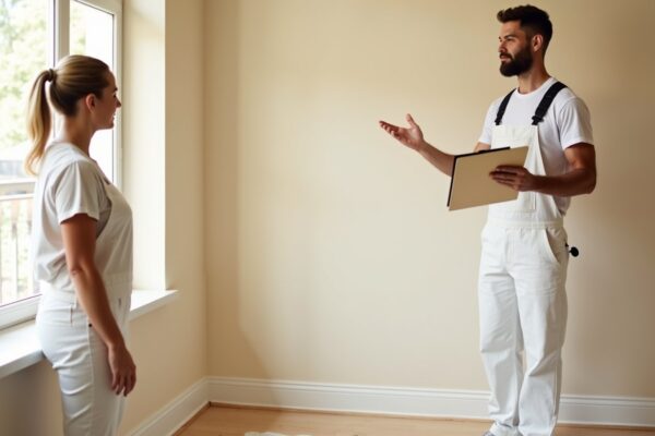
If you want to know what the room will cost once the color is settled, run the numbers with our paint cost calculator or grab a quick free painting estimate so the budget and the look are decided together rather than as a last minute surprise.
Start with what you cannot change

The most common color mistake is picking a wall color first and trying to make everything else agree with it. Reverse that. The things that are expensive or permanent set the rules, and the paint follows. Paint is the cheapest and easiest thing in the room to change, so it should adapt to everything else.
Look hard at the fixed elements. Wood or tile flooring carries a strong undertone, often warm and yellow or orange, sometimes cool and gray. Stone or quartz counters have flecks and a base tone. Backsplash tile, a brick fireplace, built in cabinets, and large pieces of furniture that are not moving all push the room in a direction. Pull a color from one of these anchors and your palette already has a reason to exist.
A practical move is to gather a physical sample of each fixed element in one spot. A square of the flooring, a chip of the counter, a tile, a cushion from the sofa. Lay them together in the room. The wall color you choose should sit comfortably next to that pile, not fight it. If a candidate clashes with the floor or makes the counter look dingy, it is out before you ever open a can.
Rank the fixed elements by how dominant and how permanent they are. A wall of brick or a large island countertop is both visually loud and impossible to swap, so it earns the most weight. A smaller area of tile or a single piece of furniture matters less and can be worked around. By deciding which anchors are truly fixed and which you might eventually change, you avoid building a whole palette around something you will replace next year. The more honest you are about what is staying, the more reliable your color decisions become.
Understand undertones
Every color has a main hue and a quieter secondary hue underneath it. That secondary hue is the undertone, and it is the reason a paint that looked like a clean gray on the chip can read distinctly blue, green, or purple once it covers a wall. Neutrals are the worst offenders because the undertone is doing most of the visible work. A greige can lean pink in one room and green in another depending on the light and what sits beside it.
You do not need to memorize color theory to use this. You just need to know the trap exists and check for it. Hold your candidate next to a pure white card and the undertone jumps out. Hold it next to the floor and the counter and you can see whether the undertone agrees with the room or argues with it. We cover this in full in our guide to paint undertones explained, and it is worth reading before you commit, because undertone mismatches are the single biggest reason a finished room feels off without anyone being able to say why.
How light changes color
The same paint can look like two different colors in two different rooms, and the reason is light. North facing rooms get cool, soft, indirect light that mutes warm colors and can make cool colors feel even cooler and a little flat. South facing rooms get warm, bright light for much of the day that intensifies warm tones and can wash out pale colors. East facing rooms are warm in the morning and cooler by afternoon. West facing rooms flip that, cool early and warm gold in the evening.
Artificial light matters just as much. Warm bulbs around 2700K add yellow and flatter warm colors while dulling cool ones. Cooler bulbs around 4000K or higher add a bluish cast that can make warm colors look gray. A color you love in the showroom under bright neutral store lighting may behave completely differently under the warm lamps in your living room at night.
This is exactly why you cannot choose a color from a chip in the store or a swatch on a screen. The light in the actual room, at the times of day you actually use it, is the only light that counts. Test on the real wall and look at the result morning, midday, and after dark before you decide.
It also helps to think about how much light the room gets in total, not just its direction. A room with one small window and a single lamp will read darker and the wall color will look deeper and more muted than the same color in a bright room with several windows. In a dim room, a color you thought was a soft mid tone can drift toward a heavy, gloomy version of itself. If the room is naturally dark, lean a shade or two lighter than you think you need, since the lack of light will pull the finished color down.
Test paint samples the right way
A tiny chip held up to the wall tells you almost nothing. Color reads differently at scale, and a postage stamp surrounded by your current wall color is being influenced by that old color. Buy sample pots of your finalists and paint a large area, ideally a square at least two feet by two feet, or paint a piece of foam board or poster board you can move around the room.
Sample boards have a real advantage. You can hold the board against the floor, next to the counter, beside the trim, and in the darkest corner and the brightest spot. You can prop one on each wall, because a color on a wall facing the window behaves differently from the same color on the opposite wall. Painting directly on the wall works too, just use two coats so you see the true opacity and color, and put your samples near a window and away from it.
Then live with them. Look at the samples in the morning, at midday, in the evening with the lamps on, and on both a sunny and an overcast day. A color that looks perfect at noon can turn cold and gloomy at night, and you only learn that by waiting a few days. Rushing this step is how people end up repainting.
When you have two or three finalists, narrow with a simple process of elimination rather than trying to fall in love. Put all the candidates up together and over a few days you will notice one quietly bothering you, maybe it goes too cold at night or clashes with the floor in daylight. Eliminate that one. Repeat until a single color is left standing that never gives you a reason to doubt it. The winner is usually not the most exciting swatch, it is the one that behaves well in every light and against every fixed element, which is exactly what you want to live with for years.
| Room light direction | How it shifts color | What to favor |
|---|---|---|
| North facing | Cool, soft, can flatten and gray out colors | Warmer tones to balance the cool light |
| South facing | Bright and warm, intensifies warm hues | Most colors work, cool tones stay crisp |
| East facing | Warm in morning, cooler by afternoon | Test at the time you use the room most |
| West facing | Cool early, warm and gold in the evening | Check evening look if used at night |
Build a whole-home palette
Choosing colors room by room with no plan leads to a house that feels disjointed. A better approach is to build a small palette that flows through the whole home. A common idea is the 60-30-10 rule. Roughly sixty percent of a room is the dominant color, usually the walls. Thirty percent is a secondary color from larger furniture or cabinetry. Ten percent is an accent in art, pillows, or a single feature. You do not have to follow it precisely, but it keeps a room from feeling either monotonous or chaotic.
For flow between rooms, pick a small number of wall colors that share a similar undertone and vary mainly in depth. A pale version in one room, a slightly deeper relative in the next, all sitting in the same warm or cool family. Keep one consistent trim color and one consistent ceiling color throughout the main living areas. That single repeated trim and ceiling is what ties everything together and lets the wall colors change without the house feeling like a patchwork.
If you want individual rooms to feel distinct, our room specific guides go deeper, including paint colors for a living room and paint colors for a kitchen, which still respect the same whole home logic.
Warm vs cool and light vs dark
Two simple sliders cover most of the mood and size decisions. The first is warm versus cool. Warm colors, the reds, oranges, yellows, and warm neutrals, make a space feel cozy, inviting, and a little smaller. Cool colors, the blues, greens, and cool grays, feel calm, fresh, and a little more open. Match the slider to how you want the room to feel. A bedroom or a den often wants warmth. A small bathroom or a busy office often benefits from cool.
The second slider is light versus dark. Light colors reflect more light and make a room feel larger, airier, and brighter, which is why small rooms usually do well with them. Dark colors absorb light and make a room feel smaller, more intimate, and more dramatic, which can be exactly right for a dining room, a study, or an accent wall. There is no universally correct answer, only the answer that fits the room's job. A small room you want to feel bigger leans light and cool. A large room you want to feel cozy can take warm and deep.
For the specific case of making a tight space feel larger, see our guide to paint colors for a small room. For a restful retreat, see paint colors for a bedroom.
Then choose the finish
Color and sheen are two separate decisions, and trying to make them at once causes confusion. Lock the color first using everything above. Only then choose the finish, because the same color in a flat finish and a semi gloss finish behaves very differently. Flat and matte hide wall imperfections and feel soft but are harder to clean. Eggshell and satin add a slight sheen and more washability, which suits most living spaces. Semi gloss and gloss are durable and wipeable, which is why they suit trim, doors, kitchens, and bathrooms.
The finish also subtly affects how the color looks. Higher sheen reflects more light and can make a color read a touch lighter and more vivid, while flat finishes mute it slightly. None of this changes which color you picked, it just changes how it performs and shines. Decide the sheen based on the room's use and how much cleaning the surface will need. Our full paint sheen guide walks through which finish belongs in which room so the durable choice and the look line up.
Frequently asked questions
How many colors should I use in a house?
For most homes, a small palette of two to four wall colors that share an undertone, plus one trim color and one ceiling color, is plenty. That gives each room a slightly different feel while keeping the whole house cohesive. You do not need a unique color in every room, and too many colors is a more common problem than too few.
Do I really need to buy samples?
Yes. Samples are the cheapest insurance against an expensive mistake. A chip or a screen cannot show you how a color behaves at full scale in your specific light next to your specific floor and counter. A few sample pots cost far less than the time and paint to redo a room you got wrong.
Why does my color look different on the wall than on the chip?
Two reasons. First, scale, because a large painted area reads more saturated and is no longer surrounded by the old wall color. Second, light, because your room's natural and artificial light is different from the store. The undertone you barely noticed on the chip can dominate once it covers a wall, which is why testing on the real wall matters.
What is an undertone?
An undertone is the subtle secondary hue sitting under a color's main hue. It is why a gray can read blue, a beige can read pink, and a white can read yellow. Undertones are the leading cause of disappointing color results. Our deep dive on paint undertones explained shows how to spot one before you commit.
Should every room in the house match?
They should relate, not match. Aim for a shared undertone and a consistent trim and ceiling color so the home flows, while letting wall colors shift in depth or family from room to room. Identical colors everywhere feel flat, and unrelated colors feel chaotic. Related colors are the sweet spot.
Where should I start?
Start with the fixed elements you cannot change, because they set the constraints. Pull a direction from the floor, counters, or large furniture, then test real samples on the wall in your own light. Once the color is settled, choose the finish, then check the project cost with our calculator so the budget is part of the decision.