In this article
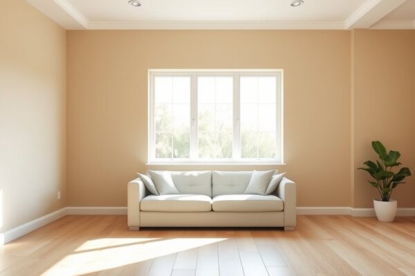
Quick answer: The best paint color for a kitchen is one that works with your fixed elements first, your cabinets, countertops, and backsplash, and then keeps the room feeling clean and bright. Crisp warm whites, soft greens like sage, gentle blues, and warm neutrals are reliable directions because they flatter most cabinet and counter combinations. The trick in a kitchen is that the walls are often the smallest painted surface, so the wall color has to harmonize with everything that is already there rather than set the tone on its own.
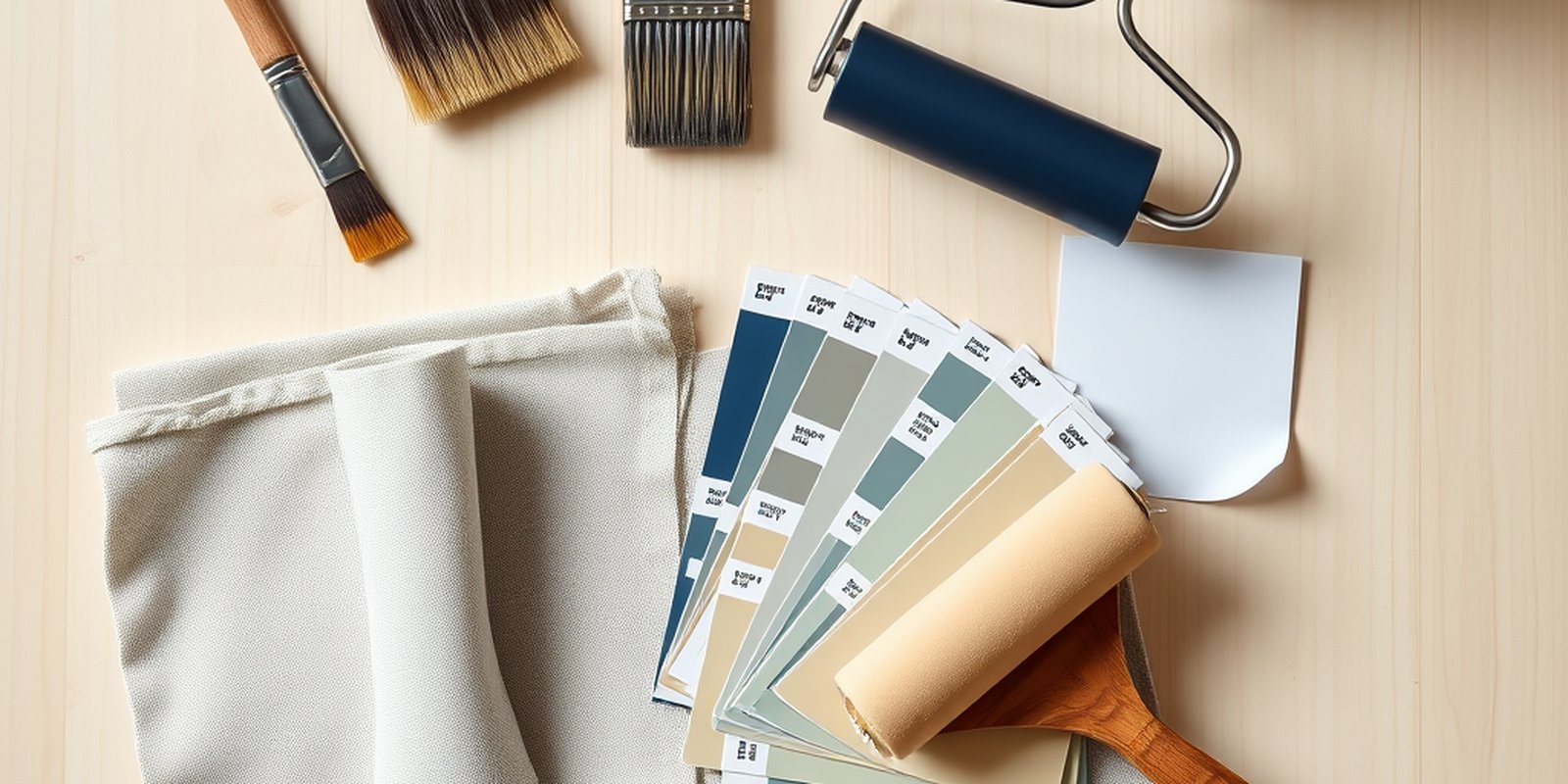
Once you have a direction, run the room through the paint cost calculator to see what the job costs, or get a fast free painting estimate if you would rather hire it out.
What makes a good kitchen color
A kitchen is a working room. It needs to feel clean, bright, and appetizing, and it has more permanent finishes competing for attention than almost any other room, cabinets, countertops, a backsplash, appliances, and sometimes a tile floor. Unlike a living room where the walls are the largest surface, in many kitchens the painted wall is reduced to the strip between the upper cabinets and the counter. That changes the whole logic of choosing a color. Here is how to think it through.
Start with the fixed elements, not the wall. Your cabinets, counter, and backsplash are staying put, and they cover far more visual area than the paint. The wall color should be chosen to flatter those finishes, not the other way around. Pick a wall color in isolation and it will almost always fight the cabinets or counter you already own.
Keep it clean and bright. Kitchens are associated with freshness and food, so colors that feel clean and light tend to work best. Bright, reflective colors also help in a room that often has limited wall space and busy surfaces. A muddy or heavy color can make a working kitchen feel smaller and less hygienic.
Respect the small canvas. Because the visible wall area is often small, you can sometimes use a slightly bolder or richer color than you would in a big open room, since there is not much of it. At the same time, a busy backsplash means the wall color should stay calm so the room does not feel chaotic. Read how much wall you actually have before you decide how brave to be.
Account for kitchen light and steam. Kitchens often mix natural light with strong task lighting under cabinets and over islands, and the color has to look right under both. The room also deals with grease and moisture, so the finish matters as much as the color, which we cover further down.
Let the cabinets set the budget for boldness. If your cabinets are already a strong color, the walls almost always want to stay quiet so the room does not feel loud. If your cabinets are a calm white or wood, you have more room to bring color onto the walls or an island. Decide where the color in the room is going to come from, the cabinets or the walls, and let one lead so they do not compete.
Colors and families that work
The single most important step in a kitchen is matching the wall to the fixed elements, so start there before you fall for a color. Look at your cabinets, your countertop, and your backsplash and decide whether each reads warm or cool. White cabinets with a cool gray quartz counter lean cool, while cream cabinets with a butcher block counter lean warm. Your wall color should generally agree with that overall temperature so the room reads as one coordinated space rather than a collision. Once you know the temperature you are working with, these real color families are dependable.
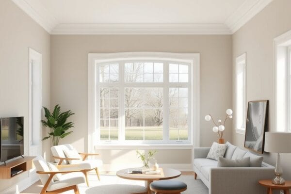
Crisp and warm whites. White keeps a kitchen feeling clean, bright, and timeless, and it lets the cabinets and backsplash be the stars. A warm white softens the room and pairs beautifully with wood and brass, while a cooler white sharpens a modern kitchen with gray or black accents. White is the safest default precisely because it sits back and works with almost anything fixed.
Soft greens like sage. Sage and other muted greens have become a natural, fresh choice for kitchens because green reads clean and organic and pairs well with both white and wood cabinets. A soft green on the walls, or even on lower cabinets, brings life into the room without overwhelming a busy backsplash.
Gentle blues. A soft, slightly grayed blue feels calm and clean in a kitchen and works especially well with white cabinets and warm wood or brass hardware. Blue reads cool and crisp, which suits the fresh feeling a kitchen wants, just keep it muted rather than bright so it stays restful.
Warm neutrals and greige. A warm beige or greige wall is a flexible backdrop that flatters cream, wood, and white cabinets alike and ties a busy room together. Neutrals are forgiving across changing kitchen light and let a colorful backsplash or bold counter take the lead.
Deeper accents and lower cabinets. If your fixed elements are fairly neutral, a richer color such as a soft navy or a muted green on an island or lower cabinets can add depth while the upper walls stay light. This is a way to bring in color without committing the whole room and without fighting the backsplash.
Remember the order of operations. Identify the temperature and colors of your fixed elements first, then choose a wall family that agrees with them. A gorgeous color that clashes with your counter is the wrong color for your kitchen, no matter how good it looks elsewhere.
Colors to be careful with
The most common kitchen color mistake is choosing a wall color that ignores the countertop or backsplash. A beige wall can turn pink or green next to the wrong granite, and a cool gray can look dirty beside a warm cream cabinet. Because the fixed elements cover so much area, a clash between wall and counter is glaring. Always hold your sample against the actual counter and cabinet, not against a white wall.
Very saturated, intense colors can also backfire in a kitchen, especially over a busy backsplash. A strong red or bright orange may look energetic on a chip but can feel overwhelming and even fatiguing in a room with so many other patterns and textures already present. If you want a bold color, an island or a single section is usually safer than every wall.
Stark, cold white can read as clinical in a kitchen meant to feel warm and welcoming, particularly under cool task lighting. And heavy, dark colors on the upper walls of a small kitchen can close the room in and make limited wall space feel cramped. Reserve deeper tones for lower cabinets or an island where they add depth without shrinking the room.
Light, undertones, and testing
In a kitchen, undertones matter even more than usual because your wall color sits inches from a counter and backsplash that have undertones of their own. An undertone is the faint secondary color hiding inside a neutral, the subtle pink, green, blue, or yellow that decides whether a beige leans warm or cool. When two undertones clash, say a pink leaning beige next to a green leaning counter, the wall can look dirty even though the color seemed fine on the chip. Our guide to paint undertones explained shows how to read these before they cause a mismatch.
Light is the other variable. Kitchens often combine window light with bright under cabinet and overhead task lighting, and a color has to look right under all of it. Cooler bulbs can make a warm white feel sterile, while warm bulbs can push a beige toward gold. Because you make decisions and judge food color in this room, getting the light and color relationship right is worth the effort. For the complete method, from inspiration to final pick, see our pillar guide on how to choose paint colors.
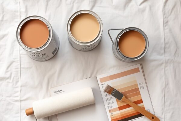
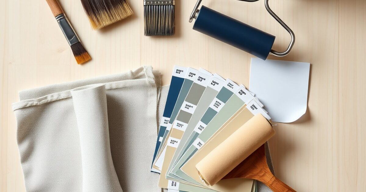
Testing in a kitchen has one extra rule, always test against the fixed elements. Buy sample pots of your top two or three colors, paint large swatches on the wall right next to the cabinets and counter, and also paint a sample board you can hold flat against the backsplash. Look at the samples in daylight and under your kitchen lights, in the morning and at night. A color that looks perfect on a far wall can clash the moment it meets your counter, so the only test that counts is the one that includes the surfaces the wall has to live beside.
Pairing color with finish and cost
Finish is especially important in a kitchen because the walls deal with grease, splatter, steam, and frequent cleaning. A flat finish shows every mark and is hard to scrub, so kitchens usually call for at least an eggshell, and often a satin, which wipes clean and resists moisture far better. The right sheen protects your color choice and keeps the room looking fresh between deep cleans. Our paint sheen guide explains how each finish handles washing and light. Choosing the wall color is only part of the job, the cabinets and trim are their own decision, and our guide to the best paint for a kitchen covers the durable products and finishes that hold up to kitchen wear.
On cost, a kitchen can be deceptively quick to paint because the visible wall area is often small, but the prep around cabinets, counters, and tile takes care. Masking off a backsplash, cutting cleanly around upper and lower cabinets, and protecting countertops all add time even when the painted area itself is modest, so the labor does not always scale down as fast as the square footage suggests. For real ranges based on room size, wall condition, and coats, see our breakdown of the cost to paint a kitchen. If you want a number tailored to your exact space, the paint cost calculator turns your measurements into an estimate fast.
Frequently asked questions
What is the best wall color for a kitchen with white cabinets?
White cabinets are flexible and pair with almost anything, so let your countertop and backsplash break the tie. Soft greens, gentle blues, warm greige, and a contrasting warm white all work beautifully with white cabinets. Decide whether your counter reads warm or cool, then pick a wall color in the same temperature family.
Should kitchen walls be lighter or darker than the cabinets?
There is no rule, it depends on the look you want. Walls lighter than the cabinets keep the room bright and let the cabinets stand out, while a deeper wall can make light cabinets pop. The key is that the wall color harmonizes with the cabinets, counter, and backsplash rather than clashing with them.
What color makes a small kitchen look bigger?
Light, bright colors that reflect light help a small kitchen feel more open, which is why warm whites and soft neutrals are popular in compact kitchens. Keeping the upper walls light and saving any deeper color for a lower cabinet or island also prevents a small kitchen from feeling boxed in.
Do I really need to match my paint to the countertop?
You do not need to match it exactly, but the wall color must work with the counter and backsplash because they cover so much area. The most common kitchen color mistake is picking a wall color that clashes with the counter undertone. Always test your sample held against the actual counter and cabinets before you buy.
What finish should kitchen walls be?
An eggshell or satin is best for kitchen walls because they wipe clean and resist grease and moisture far better than a flat finish. Flat paint looks rich but is hard to scrub, which is a problem in a room that gets splattered and steamed daily. See our sheen guide for how each finish wears.
Can I use a bold color in a kitchen?
Yes, but place it carefully. Because a busy kitchen already has cabinets, counters, and a backsplash competing for attention, a bold color often works best on a single surface like an island or lower cabinets rather than every wall. That gives you personality without overwhelming the room.