In this article
Quick answer: The best paint colors for a bedroom are soft, muted, and restful, because the room's job is to help you relax and sleep. Gentle blues, soft greens, warm neutrals, and muted, desaturated tones all create a calm mood, while loud, highly saturated, or stimulating colors work against rest. Pick a color that feels soothing in your own light, lean a little warmer or cooler depending on whether you want cozy or fresh, and keep saturation low.
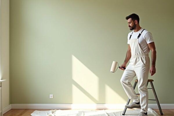
Before you commit, it helps to know the project cost so the look and the budget are decided together. Check yours with our paint cost calculator or grab a free painting estimate.
What makes a good bedroom color
A bedroom is first and foremost a place to wind down and sleep, so the color should serve calm and rest before anything else. Unlike a kitchen or office where energy and brightness help, a bedroom benefits from softness and quiet. The right color makes the room feel like a retreat the moment you walk in.
Favor low saturation. Muted, desaturated versions of a color feel calm and easy to live with, while intense, vivid colors keep the eye and mind busy. A soft, dusty version of a hue almost always rests better than its bright cousin.
Pick a mood with temperature. Cool colors like blue and green feel serene, fresh, and calming. Warm neutrals and soft earthy tones feel cozy and grounding. Decide whether you want serene or snug, and let temperature follow.
Consider how dark you want it. Light bedrooms feel airy and open. Deeper colors feel intimate, enveloping, and cocoon like, which many people find restful. A bedroom is one of the better rooms to go a little darker if you want a cozy retreat, since you are not trying to make it feel like a bright workspace.
Think about morning light. The color is the first thing you see when you wake. A soft, pleasant tone in morning light sets a gentle tone for the day, while a jarring color can feel harsh first thing.
Keep the whole envelope soft. Calm comes partly from low contrast. Soft walls with trim and ceiling that do not fight them keep the room feeling peaceful rather than busy.
Colors and families that work
Soft blues are a classic bedroom choice for a reason. Blue is calming and is often associated with restfulness, and a muted, slightly grayed blue feels serene without going cold. Soft greens, especially sage and other muted, earthy greens, bring a quiet, natural calm that suits a bedroom beautifully and pairs well with wood and natural textures.
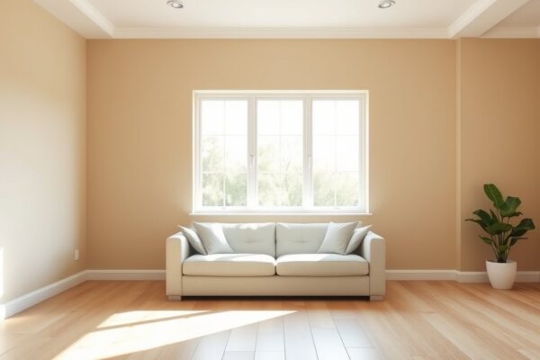
Warm neutrals are the most flexible family. Soft greige, warm taupe, and gentle warm whites feel cozy, timeless, and easy to decorate around, and they flatter skin tones in morning light. A warm white or soft cream keeps a bedroom light and airy while still feeling inviting rather than stark. For a cocooning effect, deeper muted tones like a soft charcoal, a dusty navy, or a deep muted green can turn a bedroom into an intimate retreat, as long as you keep them soft rather than harsh.
Across all of these, the common thread is muted and soft. Whether you go light or deep, cool or warm, choosing the desaturated version of the color is what keeps a bedroom restful. A dusty blue beats a bright primary blue, a soft sage beats a vivid emerald, and a warm greige beats a strong tan every time for sleep.
Think about how the color works with the room's other big surfaces too. Bedding, curtains, and a headboard take up a lot of visual space, and a wall color that flatters them makes the whole room feel intentional. Soft neutrals and muted blues and greens are easy partners for almost any bedding, which is part of why they are so popular for bedrooms. If your bedding is already colorful, a quiet, muted wall lets it shine without the room feeling overdone. If your bedding is neutral, the walls can carry a little more of the color.
It is also worth choosing a color you will be happy with for a long time. A bedroom is a private space you see every morning and night, so trend driven choices matter less here than a color that genuinely soothes you. Soft, timeless families tend to age well and stay restful year after year, which is exactly what a bedroom should do.
Colors to be careful with
Bright, highly saturated colors are the main thing to avoid in a bedroom. A vivid red, a bright orange, or an intense yellow is energizing and stimulating, which is the opposite of what you want where you are trying to rest. These colors can feel exciting in a living space but tend to keep the mind active in a bedroom. If you love a warm hue, choose a soft, muted version like a dusty terracotta or a gentle blush rather than full strength.
Very stark, bright white can feel cold and clinical in a bedroom, more like an office than a retreat. If you want light walls, a soft warm white or a gentle off white usually feels more restful than a harsh pure white. The warmth makes the difference between airy and sterile.
High contrast schemes work against calm. Sharp contrast between dark walls and bright white trim, or busy bold patterns, keep the eye moving and make a room feel active rather than peaceful. In a bedroom, softer transitions between walls, trim, and ceiling support the restful mood. Save the drama for a space where you want energy.
Be cautious with an accent wall in a bedroom too, especially behind the bed. A single bold or dark wall can look striking in photos, but in the room it can pull the eye sharply and undercut the calm you are after, particularly if the accent is high contrast against the other walls. If you want one, keep it in the same soft, muted family as the rest of the room so it adds a little depth rather than a jarring focal point. A gentle tonal accent rests far better than a loud one in a space meant for sleep.
Light, undertones, and testing
Light shapes a bedroom color as much as the color itself. A north facing bedroom gets cool light that can make a gray blue feel chilly, so you might lean a touch warmer to keep it inviting. A south facing bedroom gets warm, bright light that flatters soft warm tones and keeps cool colors crisp. Because you use a bedroom morning and night, check your candidate in early light and under your bedside lamps, since warm bulbs will pull soft colors warmer in the evening.
Undertones decide whether a calm color stays calm. A soft gray that turns blue, or a greige that goes pink under your light, can change the mood of the room entirely. Read our guide to paint undertones explained and check every candidate against a pure white card and against your flooring and bedding. The full step by step is in our pillar on how to choose paint colors, which walks through fixed elements, light, and testing in order.
Always test on the real wall. Paint a large swatch or a movable board, place it behind the bed and near the window, and look at it in morning light, daytime, and at night with the lamps on. A bedroom color needs to feel right both when you wake and when you fall asleep, and only living with the sample for a few days tells you that.
Pay particular attention to how the color looks under your bedside lamp light, since that is the last thing you see before sleep and the first soft light in the morning. Warm bulbs will pull a cool color a little warmer and can flatter soft neutrals, while cooler bulbs can make a warm color look slightly gray. If the color stays soothing under your actual evening lighting, it is a strong candidate. A bedroom is the one room where the nighttime look matters as much as the daytime one, so weight it accordingly.
Pairing color with finish and cost
Once the color is chosen, pick the finish to match how the room is used. Bedrooms see gentle wear, so a flat or matte finish is popular because it hides minor wall imperfections and gives a soft, calming, non reflective look that suits the restful mood. If you want a little more washability, eggshell is a fine middle ground. Trim and doors usually take a satin or semi gloss for durability. Our paint sheen guide covers the trade offs, and the product side is in our best paint for a bedroom guide, which pairs naturally with this color guide.
For budget, a bedroom is a moderate sized project, but the real number depends on wall condition, ceiling height, the number of coats, and whether you paint trim and ceiling too. Our cost to paint a bedroom guide gives a realistic range, and you can check your own room in a minute with the calculator so the color you love fits the budget you have.
One cost factor worth flagging is the move from a light color to a dark one, or the reverse. Going from a pale wall to a deep, saturated bedroom color can take an extra coat to cover evenly, and covering a dark wall with a soft light color may need a primer coat first. Factor that into your planning if you are making a big jump in depth, since it affects both the paint you buy and the time the job takes. A color that needs three coats is not the end of the world, but it is worth knowing before you start so the budget and the schedule are realistic.
Frequently asked questions
What is the most relaxing color for a bedroom?
Soft, muted blues and greens are widely considered the most relaxing because they read as serene and calming. Soft sage, a gentle gray blue, and warm muted neutrals all create a restful mood. The key is low saturation, since a dusty, soft version of any of these colors rests better than a bright one.
Should a bedroom be light or dark?
Both can work, and it depends on the feel you want. Light colors make a bedroom airy and open, which suits small or low light rooms. Deeper, muted colors create a cozy, enveloping retreat that many people find restful. A bedroom is a good room to go a little darker if you want intimacy, as long as the color stays soft.
Is gray still a good bedroom color?
Yes, a soft warm gray or greige is a calm, flexible bedroom color that is easy to decorate around. The thing to watch is the undertone, since some grays turn cold blue or unexpected pink in certain light. Choose a gray with a gentle warm undertone and test it on the wall in your own light before committing.
What colors should I avoid in a bedroom?
Avoid bright, highly saturated colors like vivid red, bright orange, and intense yellow, which are stimulating and work against rest. Stark clinical white can feel cold, and high contrast or busy patterns keep the eye active. If you want warmth or color, choose soft, muted versions rather than full strength ones.
Does morning light affect bedroom color choice?
Yes. The wall color is the first thing you see when you wake, and morning light can shift how a color reads. A north facing room gets cool morning light that may call for a slightly warmer color, while an east facing room gets warm morning light. Test your sample in early light to be sure it feels pleasant when you wake.
What finish is best for bedroom walls?
Flat or matte is popular for bedroom walls because it hides imperfections and gives a soft, calming look with no glare. If you want easier cleaning, eggshell works well too. Trim and doors usually take satin or semi gloss for durability. See our paint sheen guide for the full breakdown.