In this article
Trim is the framing around a room. It runs along baseboards, casings, window surrounds, crown molding, and door frames, and it quietly shapes how finished a space feels. When people ask what color to paint trim, the honest short answer is that white is the default and the safest choice. A crisp white trim gives clean contrast against almost any wall color, reads as timeless rather than trendy, and rarely looks dated a few years later. That is why builders and decorators reach for it again and again.
The catch is that there is no single white. The right white for your trim depends on the undertone of your walls and the light in the room. A warm wall paired with a cold blue white trim can look mismatched and a little clinical. Beyond white, trim does not have to contrast at all. You can paint trim the same color as the walls for a calm, seamless look, go darker than the walls for drama, or go all the way to black for a sharp modern edge. Each of those directions is a deliberate design decision, not an accident, and this guide walks through when each one works.
Before you commit to a color, it helps to know how much trim you are actually painting and what the job will cost. You can rough out the surface area and a budget with our paint cost calculator, and if you want a painter to quote the work, you can request a free painting estimate to compare against doing it yourself.
Should trim be lighter or darker than walls

This is the classic trim question, and both directions are valid. The decision comes down to the mood you want and the architecture you are working with.
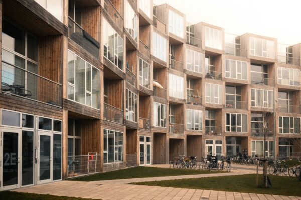
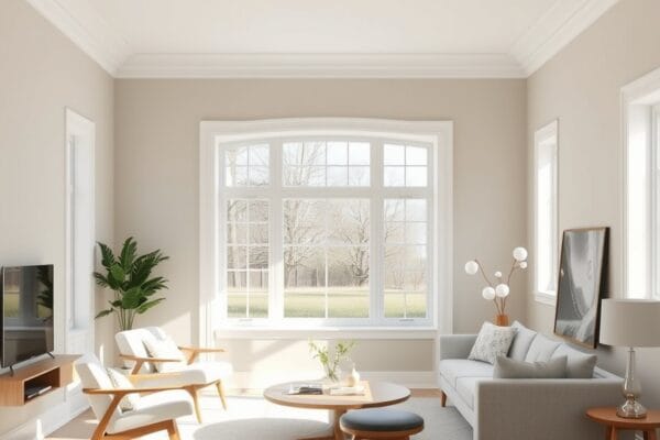
Lighter trim (the traditional choice). Painting trim lighter than the walls is the most common approach in homes across the country. White or near white trim against a colored or mid tone wall creates a clean frame that makes doors and windows pop. It reads fresh, it feels classic, and it flatters almost any wall color. Lighter trim also makes a room feel a little more open because the eye reads the bright edges as a boundary that pushes the walls back. If you are unsure, lighter trim is the lower risk path.
Darker trim (the bold choice). Painting trim darker than the walls flips the contrast. With pale or white walls and a deep charcoal, navy, or black trim, the framing becomes a feature instead of a quiet backdrop. This works beautifully on homes with character molding, paneling, or interesting window shapes, because the dark outline traces all that detail and shows it off. Dark trim feels modern, tailored, and a touch dramatic. The tradeoff is that it demands tidy paint lines and clean walls, since the high contrast hides nothing.
There is also a middle path worth naming. You can keep trim only slightly different from the walls, a half shade lighter or a soft tonal step, so the contrast is gentle rather than sharp. This suits calm, layered, modern rooms where you do not want the trim shouting.
How much contrast you want also depends on what the trim is doing in the room. If you have lovely original woodwork, tall baseboards, or detailed crown molding, more contrast shows it off. If the trim is plain and builder grade, lower contrast keeps it from drawing attention to something ordinary. Look honestly at what you have before you decide how loudly to frame it. A room with beautiful casings rewards a bright white outline, while a room with thin, basic trim often looks better with the trim quietly blended into the walls.
Choosing the right white for trim
If you land on white trim, the next job is picking the right white, and this is where most people slip. Whites are not neutral. They lean warm or cool depending on the undertone mixed into them.
Warm whites carry a hint of yellow, cream, or beige. They feel soft, cozy, and inviting, and they pair naturally with warm wall colors like greige, tan, warm gray, terracotta, and earthy greens. A genuinely well known warm white that decorators reach for is a soft off white such as a classic creamy white. Warm white trim suits older homes, traditional rooms, and any space lit by warm bulbs or southern light.
Cool whites carry a hint of blue, gray, or green. They feel crisp, clean, and a little more contemporary, and they pair with cool wall colors like blues, cool grays, and clean modern palettes. Cool white trim can look fresh in bathrooms, kitchens, and minimalist spaces, but in a warm room under warm light it can read slightly gray or stark.
The reliable rule is to match the temperature of the trim to the undertone of your wall. Warm walls want a warm white. Cool walls want a cool white. If you are not sure which way your wall color leans, our guide to paint undertones explained shows how to spot the hidden undertone by comparing your color against a true white card in daylight. Always test your white trim sample right next to the wall color, not on its own, because a white only reveals its undertone in relation to what sits beside it.
When to match trim to the wall
Painting trim the same color as the walls breaks the usual rule, and in the right room it is a smart move. When the trim and walls share one color, the framing disappears and the room reads as a single calm volume.
Small rooms. In a tight space, contrasting trim chops the walls into segments and can make the room feel busier and smaller. Matching the trim to the wall removes those visual breaks, so the eye glides around the room and the space feels larger and more serene. This trick is especially useful in small bedrooms, powder rooms, and narrow hallways. Our notes on the best paint colors for a small room lean on this same logic.
Busy or heavy trim. If a room has a lot of molding, chunky baseboards, or fussy window casings, picking those details out in a contrasting color can overwhelm the space. Wrapping everything in one wall color quiets the noise and lets the architecture read as texture rather than as a series of outlined shapes.
The modern seamless look. Painting walls, trim, and sometimes the ceiling all in one color, often called color drenching, is a current design direction that feels enveloping and sophisticated. It works best with a soft, muted color and a thoughtful mix of sheens, so the trim still catches light a little differently from the flat walls even though the color is identical.
Bold trim: dark and black
Dark trim and black trim are the most daring options, and when they land, they transform a room. Black trim around windows and doors creates a graphic, almost architectural frame, like a sketch drawn around the openings. It pairs especially well with white or very pale walls, where the contrast is at its sharpest, and it suits modern, industrial, and high contrast traditional rooms alike.
Dark trim works when a few things line up. You want enough natural light that the dark outlines feel intentional rather than gloomy. You want clean walls and tidy lines, because the contrast magnifies any drip, ridge, or wavy edge. And you want trim worth framing, such as nice windows, paneled doors, or a handsome staircase. In those settings, a deep charcoal, a near black, or a true black turns ordinary trim into a design feature.
Where dark trim struggles is in dim rooms with little natural light, where it can close the space in and feel heavy. It also asks for more careful painting, since you cannot hide mistakes. If you love the idea but feel cautious, start with one element, the front of a door or a single window, and live with it before committing the whole room.
It is also worth thinking about how dark trim connects from room to room. Because dark trim is such a strong statement, it can feel abrupt if one room has black window frames and the next has plain white ones. Many people who go dark on trim carry that choice through at least the connected, public rooms so the home reads as one consistent idea rather than a series of unrelated experiments. If you want dark trim in only one room, choose a room that feels somewhat self contained, like a study or a dining room, so the shift feels deliberate rather than random.
Trim, doors, and finish
One quiet decision pays off more than any single color choice: pick one trim color and carry it through the whole home. When every baseboard, casing, and door frame shares the same white (or the same dark), the house feels coordinated as you move from room to room, even though each room may have a different wall color. Switching trim colors room by room makes a home feel piecemeal. A single, consistent trim color is the thread that ties everything together.
Doors usually follow the trim. Interior doors painted to match the trim read as part of the architecture and keep things calm, while a door painted a contrasting color becomes a deliberate accent. Either is fine, but decide on purpose. For the products that hold up on these high touch surfaces, see our guide to the best paint for trim and doors, which covers the durable enamels that resist scuffs and clean up well.
Finish matters as much as color on trim. Trim is touched, bumped, and wiped constantly, so it wants a tougher, shinier finish than the walls. A semi gloss or satin enamel is the standard choice because it wipes clean and gives trim that subtle crisp sheen that sets it apart from flat walls. Our paint sheen guide explains how to match sheen to the surface and the wear it sees.
Finally, plan the budget. Trim is fiddly and slow to paint well because of all the cutting in and the careful lines, so it can cost more per square foot than open walls. You can see realistic numbers in our breakdowns of the cost to paint trim and baseboards and the cost to paint interior doors, then sanity check the whole job against our calculator or a free estimate.
Frequently asked questions
Should trim be white?
White is the default and the safest choice because it gives clean contrast against almost any wall color and stays timeless. It is not the only option, though. Trim can match the walls for a seamless look, go darker for drama, or go black for a modern edge. White simply carries the lowest risk of looking dated or mismatched.
Should trim be the same white as the ceiling?
It can be, but it does not have to be. Many people use a dedicated ceiling white (often flat) on the ceiling and a more durable warm or cool white in a satin or semi gloss on the trim. If you want the cleanest, simplest result, a single white used on both in the right finishes looks calm and coordinated. Just make sure both lean the same temperature as your walls.
Can trim be darker than the walls?
Yes. Trim that is darker than the walls, including charcoal, navy, or black, frames windows and doors and gives a room a tailored, modern feel. It works best with pale or white walls, good natural light, and tidy paint lines, since high contrast hides nothing.
What is the best white for trim?
The best white is the one that matches your wall undertone. Warm walls want a warm, slightly creamy white, and cool walls want a crisp, cool white. Test the white sample directly beside your wall color in daylight, because a white only reveals its undertone next to another color. Our undertones guide shows how to read it.
Should trim be semi gloss?
Semi gloss is a popular trim finish because it is durable, wipes clean, and gives trim a crisp sheen that separates it from flatter walls. Satin is a slightly softer alternative if you prefer less shine. Either works far better than a flat finish on a surface that gets touched and scuffed. See the sheen guide for the full comparison.
Can I use the same trim color in every room?
Yes, and you should. One consistent trim color carried through the whole home ties the rooms together as you move between them, even when each room has a different wall color. Changing trim color room by room makes a house feel disjointed.