In this article
Choosing exterior paint colors feels high stakes, and it should, because the outside of a house is large, expensive to repaint, and on display to the whole street. The good news is that there is a clear method that takes most of the guesswork out of it. Instead of starting from a color you like and hoping it works, you start from the parts of the house you cannot change, build a small coordinated palette around them, test it outdoors at full size, and respect any rules your neighborhood imposes. Follow that order and the result almost always lands.
The honest short answer is this. Begin with the fixed exterior elements, the roof, stone, brick, and hardscape, and your home's architectural style. Pick a body color, a trim color, and one accent color (usually the front door). Test big samples on the actual walls in real daylight before you commit, and check any HOA or neighborhood requirements first. That sequence is the whole method, and the rest of this guide walks through each step.
Before you fall in love with a scheme, it helps to know the scale of the job and the budget. You can estimate the exterior square footage and cost with our paint cost calculator, and because exterior work involves ladders, prep, and weather, requesting a free painting estimate is a smart way to compare hiring out against doing it yourself.
Start with the fixed elements
The single biggest mistake in exterior color is choosing the body color first and ignoring everything that is already there. Your house already has colors locked in that you are not going to repaint, and your new palette has to live alongside them. Start there.
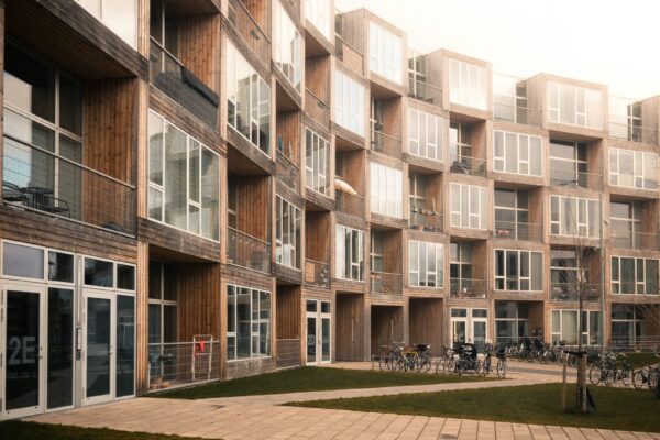
The roof. The roof is usually the largest fixed surface and it sets the temperature of the whole house. A roof with warm brown or tan tones pushes you toward warm body colors, while a cool gray or blue gray roof sits better with cooler bodies. Hold your candidate body colors up against the roof and ask whether they feel like they belong together or like they are arguing.
Stone and brick. Any stone, brick, or masonry on the facade carries strong undertones that your paint must flatter, not fight. Brick that leans red and orange wants body and trim colors that calm it rather than clash with it, often warmer neutrals or soft contrasting tones. Stone with mixed gray and tan tones gives you flexibility but still has a dominant lean to respect. Pull your body color from the quieter tones in the stone or brick and it will feel intentional.
Hardscape and surroundings. Driveways, walkways, patios, and the landscaping all sit in the same picture as the house. A warm tan paver path or a cool concrete drive nudges the palette the same way the roof does. It is also worth glancing at the neighboring homes. You want your house to fit the street, not to be a near copy of the house next door or a jarring outlier. Fitting in while still feeling like yours is the goal.
The three color formula
A clean exterior palette is built from three roles, and keeping it to three is what makes a house look composed rather than chaotic.
Body color. This is the dominant color on the main walls, the largest area by far, so it should be the most restrained and livable of the three. Soft neutrals, muted earth tones, grays, greiges, and gentle colors all work well as a body because they are easy to live with for years and flatter the fixed elements. Save the personality for the smaller surfaces.
Trim color. Trim outlines the windows, doors, fascia, and corners, and it usually contrasts with the body to define the architecture. Classic schemes pair a colored body with a lighter trim, often a soft white or cream, which crisply frames the openings. A darker trim against a light body is the bolder, more modern alternative. Either way, the trim is the second most prominent color and should coordinate cleanly with the body.
Accent color. The accent is the small dose of personality, almost always the front door and sometimes shutters. Because it covers so little area, the accent is where you can be brave with a stronger or deeper color. A roughly sensible proportion is a dominant body, a clear band of trim, and just a small punch of accent. That balance keeps the house feeling coordinated while still giving it a focal point.
Architectural style and color
Houses have a style and an era, and color reads best when it respects that character. Painting a house in colors that fit its architecture makes it look authentic, while fighting the style can make even a pretty color feel off.
Traditional and historic homes often suit classic, slightly muted palettes drawn from their period, warm whites, deep greens, soft grays, and earthy tones that feel timeless. Craftsman and bungalow styles wear earthy, nature derived colors well, with deeper bodies and contrasting trim that emphasize the woodwork. Modern and contemporary homes lean into crisp, high contrast schemes, often cooler neutrals and bolder dark and light pairings that suit their clean lines. Farmhouse styles favor soft whites, warm neutrals, and the occasional dark contrast.
You do not have to copy a period exactly, but it helps to ask what colors feel native to your home's shape and age, then choose within that family. A palette that suits the architecture looks settled and right, even to people who could not name why.
Light, scale, and testing outdoors
Exterior color behaves very differently from interior color, and skipping the outdoor test is the most common path to regret. Two things change once paint goes outside.
First, exterior colors read lighter outdoors. Bright, open daylight washes color out, so a color that looks like a comfortable mid tone on a small chip can look pale and washed out across a whole sunlit wall. The reliable fix is to choose a color a shade or two deeper than the one that looks right on the chip, because the sun will lighten it. Second, large areas read more intensely than small samples. A color that seems subtle on a swatch can feel much stronger spread across an entire facade, so what looks safe on paper can surprise you at full scale.
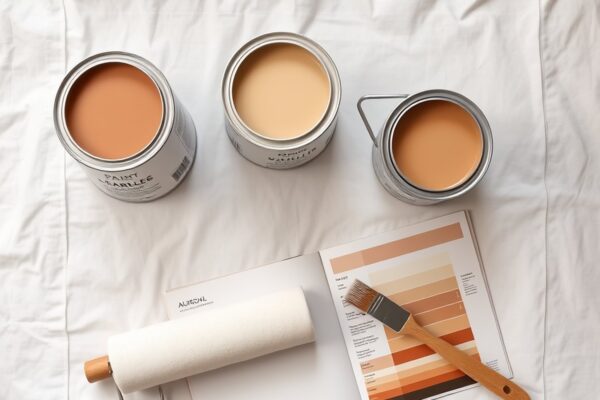
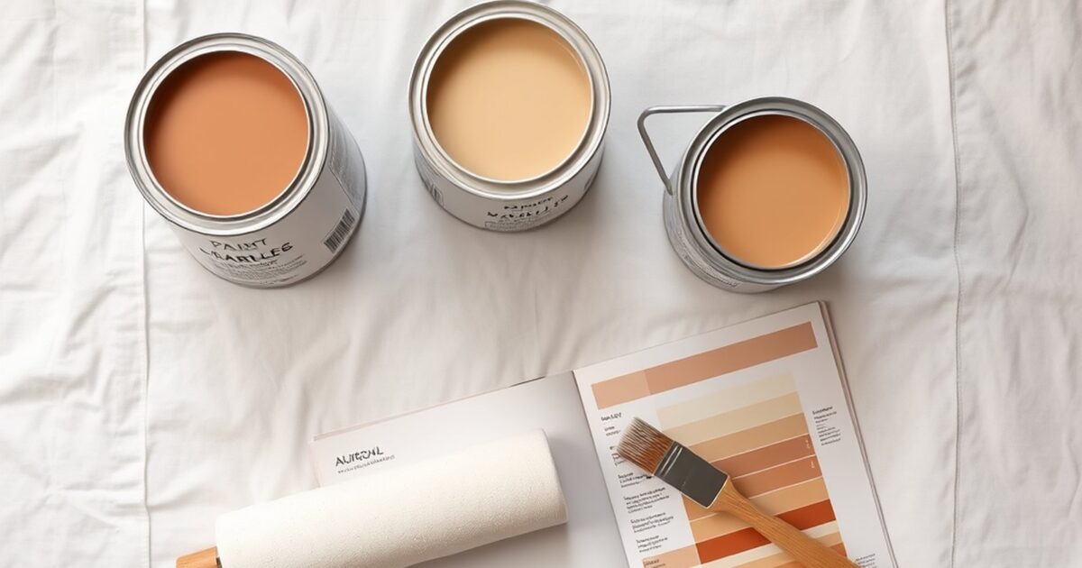
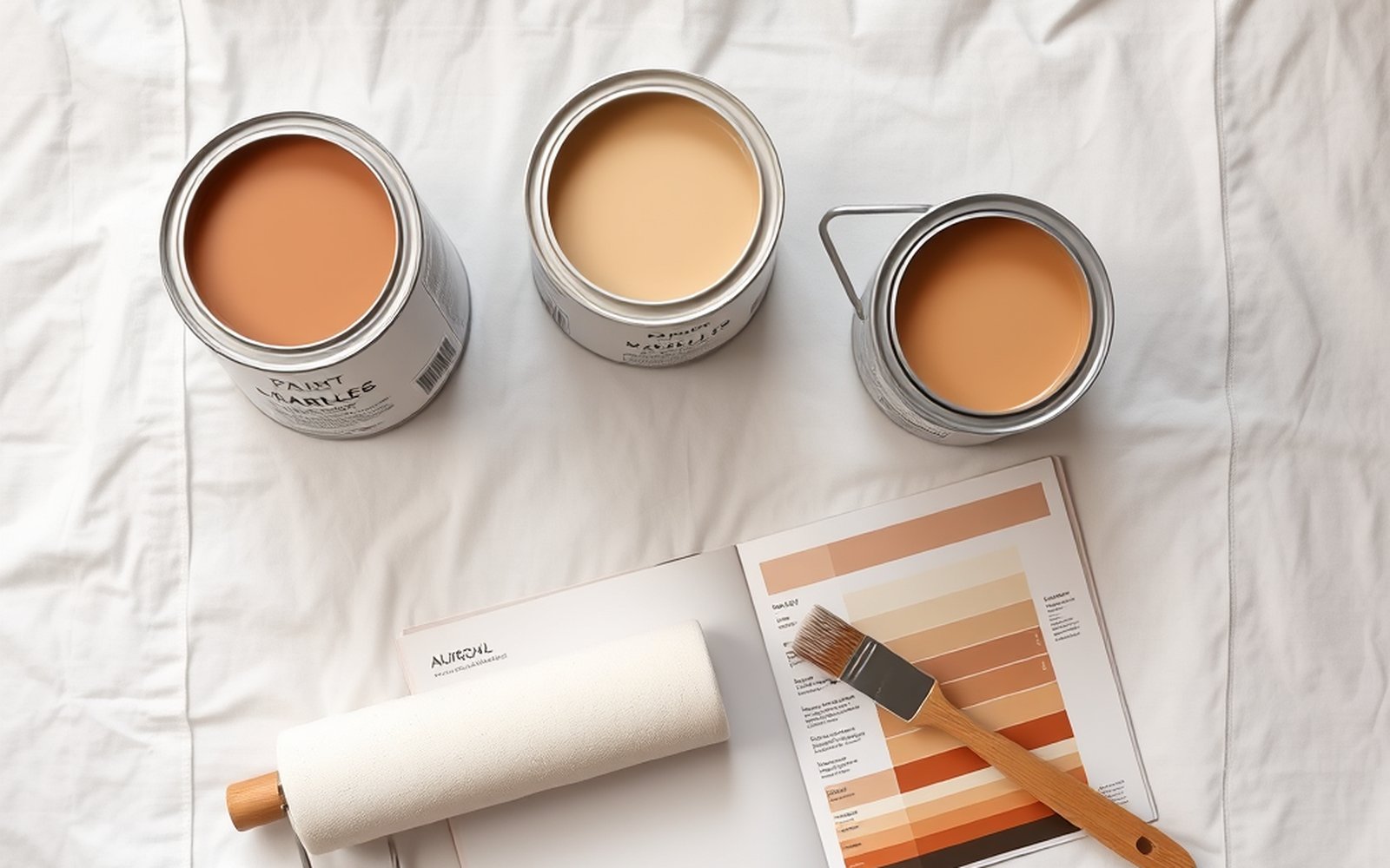
The test that prevents mistakes is simple. Get large samples, paint big patches, at least a couple of feet square, directly on the actual exterior walls, and place them on different sides of the house. Then look at them across a full day, in morning light, harsh midday sun, and softer evening light, because the same color shifts dramatically as the sun moves. A north facing wall and a south facing wall will show the same paint very differently. Judging the color on the real wall, in real daylight, over real hours is the only way to know. Understanding the warm or cool undertone underneath your candidates makes those shifts easier to predict, and our guide to paint undertones explained shows how to read them.
HOA rules and the neighborhood
Before you buy a drop of paint, find out whether you are even allowed to use the colors you like. Many neighborhoods, especially those with a homeowners association, maintain an approved color palette and require you to submit your scheme for approval before painting. Repainting outside those rules can mean fines and being forced to repaint, which is an expensive way to learn the lesson.
Check the HOA guidelines or covenants early, request the approved palette if there is one, and get written approval before work begins. Even without a formal HOA, it pays to consider the street. A house should fit its neighborhood, complementing the homes around it rather than clashing or copying. You can still have a distinctive, personal exterior while staying within the spirit of the street, and doing so protects both your enjoyment and your home's value.
Front door and accent color
The front door is the single best place to be bold. It is small, it is the focal point of the entry, and it is cheap and quick to repaint if you change your mind, so it carries almost no risk. A deep, saturated color on the door, a rich blue, a confident green, a warm red, or a glossy black, gives the whole facade a focal point and a dose of personality that the larger surfaces should not carry.
Choose a door color that contrasts pleasingly with the body and trim and that still respects the fixed elements and style. Because the door is such a small area, you can afford a stronger statement here than anywhere else on the house. If you want to budget the door as its own small project, our breakdown of the cost to paint a front door covers the numbers, and our notes on choosing colors throughout the home are in our guide to how to choose paint colors.
Color, finish, and cost
Exterior paint has to survive sun, rain, and temperature swings, so finish and product matter as much as color. Body surfaces usually take a flat or low sheen finish that hides siding imperfections, while trim and doors often step up to satin or semi gloss for durability and a crisp look. Our paint sheen guide explains how to match sheen to each exterior surface and the wear it faces.
The table below shows honest general pairings between common roof colors and the body colors that tend to sit well with them. These are starting points based on warm and cool harmony, not rankings or data, so always confirm with real samples on your own walls.
| Roof color | Body colors that tend to pair well | Why it works |
|---|---|---|
| Warm brown or tan | Warm beige, greige, soft cream, muted sage | Warm body matches the warm roof temperature |
| Cool gray or blue gray | Cool gray, soft blue gray, crisp white | Cool body keeps the palette consistent and clean |
| Black or charcoal | White, light gray, deep navy, warm taupe | Neutral roof is flexible and takes light or dark bodies |
| Red or terracotta | Warm cream, soft tan, muted olive or sage | Earthy warm bodies calm and complement the red tones |
| Green (aged or patina) | Warm white, soft gray, muted earthy tones | Quiet neutrals let the unusual roof color lead |
Finally, plan the budget before you commit, because exterior painting is one of the larger home projects, involving prep, ladders or lifts, multiple coats, and weather windows. You can see realistic numbers in our breakdown of the cost to paint a house, then sanity check the project against our calculator or request a free estimate to compare quotes.
Frequently asked questions
Where do I start when choosing exterior paint colors?
Start with the fixed elements you cannot change, namely the roof, any stone or brick, the hardscape, and your home's architectural style. Pull your body color from the quieter tones already present, then build trim and accent colors around it. Choosing the body color first and ignoring what is already there is the most common mistake.
How many colors should an exterior have?
Three is the reliable formula. A dominant body color on the main walls, a coordinating trim color to outline windows and corners, and one accent color (usually the front door) for personality. Keeping it to three roles makes a house look composed rather than busy.
Why does my exterior color look lighter than the sample?
Bright outdoor daylight washes color out, so a color reads lighter and a little less intense on a full sunlit wall than it does on a small chip indoors. The fix is to choose a shade or two deeper than the one that looks right on the chip, and to test big samples on the actual walls before committing.
Do I need HOA approval to repaint my exterior?
If your neighborhood has a homeowners association, very often yes. Many maintain an approved color palette and require you to submit your scheme before painting, with fines or forced repainting if you skip the step. Check the guidelines and get written approval before any work starts, and even without an HOA, choose colors that fit the street.
What color should I paint the front door?
The front door is the best place to be bold, since it is small, it is the entry focal point, and it is quick and cheap to repaint. A deep, saturated color, such as a confident blue, green, red, or glossy black, gives the facade a focal point. Just make sure it contrasts pleasingly with the body and trim and still suits the home's style.
How should I test exterior colors before committing?
Paint large patches, at least a couple of feet square, directly on the actual exterior walls on several sides of the house. Look at them across a full day in morning, midday, and evening light, because the same color shifts as the sun moves and as it hits different walls. Judging real samples on the real wall in real daylight is the only dependable test.