In this article
- What an ombre finish is and where it works
- Choosing your tones
- Tools and materials
- Surface prep and marking the blend zones
- Step by step: work fast while wet
- Vertical, horizontal, and reverse gradients
- Common mistakes and how to fix them
- Blending tools compared
- Sealing and durability
- DIY versus pro and effort level
- Frequently asked questions
Quick answer: An ombre wall is a smooth gradient that fades from one color into another, usually light to dark up or across a wall. The make-or-break step is blending the seams while the paint is still wet with a dry brush. Wait too long and the transition sets into a hard line you cannot fix without repainting.
What an ombre finish is and where it works
Ombre, from the French for shaded, is a graduated blend where one color melts into the next with no visible boundary. Most walls use two or three tones of a single hue, going light at the top to dark at the bottom or the reverse, though horizontal and diagonal fades work too. Unlike a sponged or washed finish, ombre is not about texture; it is about a seamless color transition, which is what makes it feel modern and calm.
It shines behind a bed as a headboard-height feature, in a nursery, up a stairwell, or on a single accent wall where the gradient draws the eye. Worth being clear here: an ombre wall is a technique, not a decorating theme. If you are hunting for accent-wall design concepts and color pairings rather than the how-to, start with the accent wall ideas and come back for the method. Ombre works on any smooth interior wall; it is harder to pull off convincingly on heavily textured surfaces where the blend can look patchy.
Choosing your tones
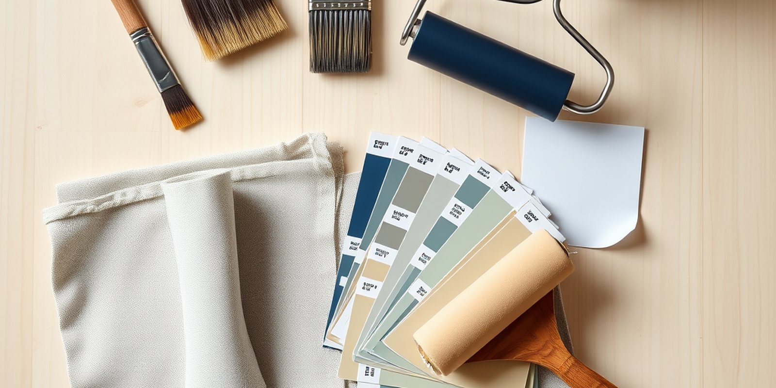
The cleanest ombre uses two or three shades of the same color, and the easiest way to get them is to pull a single paint chip strip and choose adjacent steps, or ask for one color mixed at full, half, and quarter strength. Tones from the same family blend without turning muddy because they share an undertone. If you want to fade between two different colors, keep their undertones related or the midpoint goes gray and dirty. The guide to choosing paint colors and the breakdown of paint undertones are the two references to lean on here, because a botched ombre is almost always a color choice problem, not a brushwork problem.
Buy a small amount of a neutral mixing color or extra of your lightest and darkest tones so you can custom-blend an intermediate shade if the transition needs one. Three zones blend more gently than two.
Tools and materials
By type: a base color and two or more gradient tones in a flat or eggshell sheen, a roller and tray for laying each band, and the key blending tools, which are a wide dry brush or a large dry foam brush, plus a mini roller. Some people blend with a dampened large sponge instead. Add painter’s tape, a level or chalk line to mark your zones, a drop cloth, and rags. A pencil for light marks helps you plan the blend bands before any paint goes up.
Standard interior latex is fine. You do not need special paint for ombre. The trick is entirely in the technique and the timing.
Surface prep and marking the blend zones
Prep as you would for any wall: patch, sand smooth, clean, and roll a base coat of your lightest tone across the whole wall first, letting it dry. A uniform base gives the gradient something even to sit on. If your wall needs filling or sanding, the wall prep guide covers it.
Now plan your bands. Divide the wall height into horizontal zones, one per color, and lightly pencil the boundaries. The trick is that the colors do not meet at a hard edge; instead each zone has a blend band, a stripe of overlap where two tones will merge. Mark those blend bands generously, because a wide overlap zone is far easier to blend smoothly than a narrow one. For a two-color fade you need one blend band in the middle; for three colors you need two.
Step by step: work fast while wet
Speed is the whole game with ombre, so set yourself up to move. Have every color open and a brush ready before you start, and pick a wall section you can finish before the paint skins over. On a large wall, work in vertical strips so you always keep a wet edge, the same discipline that makes a color wash succeed.
Roll your lightest tone into its zone at the top, stopping partway into the blend band rather than at a hard line. Immediately roll the next tone into its zone below, again overlapping into the same blend band so the two colors sit wet against each other. Do not let that overlap dry.
Now blend. Take the dry brush and, using light, sweeping strokes, work back and forth horizontally across the wet overlap, feathering the darker color up into the lighter and the lighter down into the darker. Keep the brush fairly dry; wipe it on a rag as it loads up with paint. Long, overlapping, feathery strokes are what dissolve the boundary. Keep moving until the transition looks like a smooth fade with no line. If it starts to drag or the paint has tacked, you waited too long; mist the band lightly or work a hair faster on the next section.
Repeat down the wall for each additional color and blend band. When all zones are up and blended, step back six feet and check the gradient from a distance, because up close every ombre looks slightly streaky and only reads as a smooth fade from across the room. Touch up any spot that still shows a seam while it is workable. A gentle vertical dry-brush pass at the very end can even out any horizontal brush texture.
Vertical, horizontal, and reverse gradients
The classic ombre runs vertically, light at the top fading to dark at the bottom, which grounds a room and makes ceilings feel taller. Flipping it, dark at the top to light at the bottom, feels more dramatic and can make a low ceiling feel cozier, though it takes a slightly steadier hand because the eye scrutinizes the lighter lower band where furniture sits. A horizontal gradient, fading across the wall from one side to the other, is less common and harder because your blend bands are vertical and gravity works against you as drips want to run down through the seam, but it makes a striking headboard wall. Whichever direction you choose, the method is identical: adjacent wet zones, a generous overlap, and fast dry-brush feathering.
Scale matters too. A short accent behind a bed or a nursery half-wall is beginner territory because you can reach the whole blend band before it dries. A full-height wall or a stairwell run multiplies the difficulty, because keeping the entire overlap wet across a large span is physically demanding and often needs a second pair of hands, one person rolling while the other blends.
Common mistakes and how to fix them
The number one mistake is a hard line, and it comes from blending too slowly. The overlap dried before you feathered it. The only real fix is to re-wet or repaint that band and blend faster next time. A muddy midpoint means your two colors have clashing undertones; choose tones from the same family. Visible roller texture in the blend comes from a wet or overloaded blending brush, so keep it dry and wipe often. An uneven, patchy gradient usually means the blend bands were too narrow, so give yourself a wider overlap zone. And if the whole wall looks streaky up close but you have not stepped back, relax and check it from a distance first, because ombre is meant to be read from across the room.
Blending tools compared
Your choice of blending tool shapes how the gradient turns out, so it is worth understanding the options before you start. A wide dry brush, natural or synthetic bristle, gives the softest, most controllable feather and is the most common choice; the long bristles drag color across the overlap without leaving heavy texture. A dry foam brush or foam mini-roller moves faster over a big band and leaves a very smooth blend, but it can lift too much paint if you press hard, so keep the pressure feather-light. A large dampened sponge, worked in gentle circles, gives a diffuse cloud-like transition that suits softer, less defined gradients, though it is harder to keep even across a tall wall.
Whatever you pick, the same rule holds: the tool must stay nearly dry. A loaded blending tool smears rather than feathers and drags visible streaks into the wet paint. Keep a dry rag in your free hand and wipe the tool clean every few strokes. Many people keep two of their chosen tool going, swapping to a clean one the moment the first loads up, which keeps the blend moving without a pause that would let the overlap tack over.
Sealing and durability
An ombre wall in standard interior paint is as durable as any painted wall and usually needs no topcoat. Because the finish is smooth rather than textured, it wipes clean like a normal wall. If it is in a high-touch spot and you used a flat sheen, a clear matte water-based topcoat adds scrub resistance without changing the gradient. There is no fragile glaze layer to protect the way there is with sponging or color washing, which makes ombre one of the lower-maintenance decorative finishes once it is up.
DIY versus pro and effort level
Ombre is very doable as a DIY project, but it is less forgiving than sponging because the wet-blending window is short and unforgiving of hesitation. It rewards practice, so blend a test board first until the fade looks smooth, then commit to the wall. A single feature wall is typically a half-day of active work once the base coat has dried, and the cost is mostly a couple of quarts of paint plus a good dry brush.
Consider a pro for tall stairwell walls, large open-plan feature walls, or a multi-color diagonal gradient, where keeping a wet edge across a big area is genuinely hard to do solo. If you are budgeting a larger job, estimate it with the painting cost calculator or get a tailored figure from the free painting estimate. For where ombre fits among the other broken-color and gradient techniques, and what to try next, see the decorative paint finishes overview and the companion sponge painting walkthrough. If you are planning the room as a whole, the room painting guide ties it together.
Frequently asked questions
How many colors do I need for an ombre wall?
Two colors is the minimum, but three tones of the same hue blend the most gently and give a smoother, more gradual fade. Pulling adjacent steps from one paint chip strip is the easiest way to get colors that transition cleanly.
What is the secret to a smooth ombre blend?
Blend the overlap between two colors while both are still wet, using light sweeping strokes with a dry brush. Speed is everything. If the paint skins over before you feather it, the transition sets into a hard line you cannot fix without repainting.
Do the ombre colors need to be the same hue?
Not strictly, but same-hue tones are far easier because they share an undertone and never turn muddy. If you fade between two different colors, keep their undertones related, or the midpoint where they meet can go gray and dirty.
How is an ombre wall different from an accent wall?
An ombre wall is a technique, a graduated color fade. An accent wall is a design choice, one wall painted differently from the others in any color or finish. You can make an accent wall using the ombre technique, but the two terms describe different things.
Can I do an ombre wall over texture?
You can, but heavy texture makes the blend harder and can look patchy because paint catches in the low spots. Smooth walls give the cleanest gradient. On textured walls, use a wider blend band and check the fade from a distance as you work.
Do I need to seal an ombre wall?
Usually no. Because ombre uses standard interior paint on a smooth surface, it is as durable as any painted wall and wipes clean. In a high-touch area with a flat sheen, a clear matte topcoat adds scrub resistance without altering the gradient.